I really like this one the colours look really good together and work well with the image. Theres alot of text which fill the magazine and make it look good. Also I like the name and layout of the masthead, it's something different and kind of mysterious because not alot of people may know what it means, so want to buy it to find out.
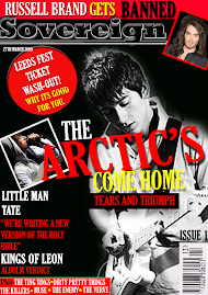
I think this one looks the best so far. I think the black and blue works really well. I like the photo for the front cover if you take one similar it will look really good. I also think the name of the magazine sounds good.
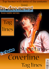
 This is my first design for a magazine.
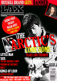


I really like this one the colours look really good together and work well with the image. Theres alot of text which fill the magazine and make it look good.
ReplyDeleteAlso I like the name and layout of the masthead, it's something different and kind of mysterious because not alot of people may know what it means, so want to buy it to find out.
I think this one looks the best so far. I think the black and blue works really well. I like the photo for the front cover if you take one similar it will look really good. I also think the name of the magazine sounds good.
ReplyDelete