When I began my foundation portfolio I had never used Photoshop or Quark Xpress software before and was not familiar with how they worked. As a result of my in experience in my pre lim task I found it really hard to use quark so instead I used Photoshop. I enjoyed using Photoshop as I found it simple to use but with good results and effects when used correctly. As I had already used Photoshop I found it a lot easier when it came to completing my final task on however although I still struggled on Quark I managed to adjust and use it successfully to create my double page spread. I still preferred Photoshop as I found it great for editing photos I had taken and making them look professional and making them look right for the genre of my magazine. Quark however is a lot more useful at producing articles and formatting a double page spread to make it look like a profession article.
The conventions in both the prelim task and the final task were very similar as they were both magazines so they both contained the typical conventions of a magazine such as a masthead, cover lines, tag lines and pull quotes. However there were some differences such as the pre lim task required a lot less conventions as my final magazine as a college magazine does not have as much content as a music magazine.
Planning was vital in the final task as there was so much more which needed to be completed then in the pre lim so it was easier to fall behind on the work and not complete it by the deadline. Precise planning should have been used to ensure that every aspect of the project was completed whether that be the double page spread or the blog posts. In the pre lim less work was required as only a front cover and contents was required and therefore planning was not as vital.
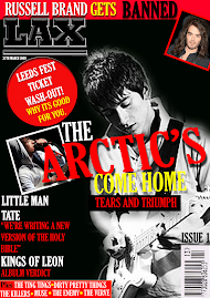
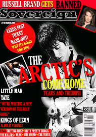
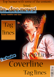
I produced three different drafts and received feedback from others, telling me which they thought were the best and what they thought could be improved. By doing this I could see what appealed to my target audience and therefore ensure that my magazine was successful.
Friday, 8 May 2009

NME Research
NME is a popular music magazine and is one of the longest running music magazines in the UK. Originally called New Musical Express the magazine offer a wide range of articles and information about the latest bands and gigs. I believe its target audience is people of an age of 15 onwards male or female who have an interest in Indie music. As it is a mainstream magazine it has a large target audience and its readership is high. Its total circulation from July to December in 2008 was 48,459.
Unlike the styles of other music magazines such as ‘Kerrang’ or ‘Top of the pops’ the front covers for NME are always pretty simple and only contain a few images. The magazines background colours are always quite simple and do not require many props. The simplicity of the magazine is what appeals to the readers as it is not vivacious like magazines which young children have.
The magazine NME is now also part of a conglomerate. This is because NME now have a radio station, a TV station and magazine and a website. This is only possible as the magazine is a mainstream magazine and its radio stations are garneted to be successful.
Unlike the styles of other music magazines such as ‘Kerrang’ or ‘Top of the pops’ the front covers for NME are always pretty simple and only contain a few images. The magazines background colours are always quite simple and do not require many props. The simplicity of the magazine is what appeals to the readers as it is not vivacious like magazines which young children have.
The magazine NME is now also part of a conglomerate. This is because NME now have a radio station, a TV station and magazine and a website. This is only possible as the magazine is a mainstream magazine and its radio stations are garneted to be successful.
Double Page Spread research

This is an example of a double page spread from the magazine I am basing my magazine NME. The magazines the same genre as my magazine and therefore I believe I should follow the same conventions as they do .In this double page spread a picture takes up a whole side of the spread and therefore makes it clear who the article is about. The picture and the title are the only areas was which are in colour on the double page spread the rest is in white and black so they therefore stand out more. The title takes up about a quarter of the first page so it is clear which band the article is about. By doing this it would attract readers who like ‘The Verve’. Also the colour green connotes ‘relaxation’ and being calm. This would appeal to the audience as they would believe that the article is calm and relaxing,

This double page spread is from a magazine which is based around a completely different music genre ‘Pop’. The eccentric use of colour in this double page spread is too ‘girly’ and vivacious for my magazine. However the use of anchorage over the images to show who the people is a great idea and I may use it. The large cover line at the top of the page spanning both pages is effective as it makes it clear what the article is about. Also the banner down the left hand side is effective as it breaks the double page up and makes it look less cluttered. I may use this idea.
This double page spread is from a magazine which is based around a completely different music genre ‘Pop’. The eccentric use of colour in this double page spread is too ‘girly’ and vivacious for my magazine. However the use of anchorage over the images to show who the people is a great idea and I may use it. The large cover line at the top of the page spanning both pages is effective as it makes it clear what the article is about. Also the banner down the left hand side is effective as it breaks the double page up and makes it look less cluttered. I may use this idea.
Double Page Spread Analysis (Second Page)

This page is taken up by the image of Lilly Allen. Everything in this image has been mediated to create a certain effect. The desired effect is that of anger and rudeness. We see this by the gold chains Lilly Allen is wearing around her neck. These have connotations of ‘chav’ and they are considered to be rude and inconsiderate people. By Lilly Allen wearing these it makes the pull quote ‘‘PEOPLE THINK IM AN ATTENTION SEEKER, BUT IM JUST HONEST.’ Stand out even more as her rude, obnoxious words appear to be reinforced with her picture. Also her facial expression shows how she is not actually bothered about what people think of her as she does not look concerned nor does she look happy she appears to have a simple relaxed expression. However her gesture, having her hands on her hips, connotes that she is confident and cocky and yet again appears rude. Her hair and make up and clothes have also been mediated to not only make her appeal to the audience, as she appears to have the ‘Indie’ style and as this is a magazine which targets the ’Indie’ society, but also reinforce the idea of arrogance in the pull quote.
Double Page Spread analysis

The headline of the article ‘PEOPLE THINK IM AN ATTENTION SEEKER, BUT IM JUST HONEST.’ This is a pull quote used form the actual article itself and by doing this it interreges the audience into wanting to know more about this quote and why she said it. It also connotes that Lilly Allen is a very self obsessed person who often thinks abut herself before others. The font used appears very fragmented and broken which suggests that the interview is very broken and fragmented and suggests that Lilly Allen is broken up mentally and also unstable. The headline is also done in uneven sizes and by doing this it has a very child-like representation. The connotation of child-like is fun so by doing this it interreges the audience to read the article to see why Lilly Allen is like this. The bold white text on a black background makes the text stand out and would automatically catch the reader’s eye. A drop capital is used in the article to represent that it is the beginning of a new article. The article itself is divided into four equal columns with gutters all in the same font size and alignment. The page number and the magazines name and the date of the article are all in print at the bottom left hand corner in black with the NME logo next to them. This helps to create a ‘House style’ as it is repeated on every page. The picture credits are not a part of the actual interview so are mentioned in small black writing to give the information needed without obvious attention being drawn.
Contents Page analysis

This contents page has many of the typical conventions which are expected in a music magazine. Firstly it has the Masthead clearly pointed at the top of the page. By doing this it is made clear to the audience which magazine this is. Also there are promotional methods used as a large box is used at the bottom which promotes the magazine as it mentions about subscription details. By doing this they can ensure that there readership stays high as readers who are already reading the magazine would be interested in subscribing to it. Black is used as it connotes strength and power so it gives the impression that the music and artists in the magazine will be powerful and strong. Also the colour of red used connotes danger so it may appeal to the male audience more as it reinforces their masculinity. The white however contrasts with the red and black and as a result make it apparent to the audience that the magazine is not heavy rock or metal. One large image is used in the centre of the page which means draws the audience’s attention to that and it connotes that that picture is from the main and most important article.
Bauer and IPC Media Research
Bauer and IPC Media are two media corporations who specialise in the magazine market area. Both of these companies dominate the UK’s magazine industry and distribute a wide range of magazines which range from niche magazines to mainstream magazines. Beaur is a German multinational cross media company. It is also an independent company. This is in great contrast to IPC Media as they are part of the conglomerate American Time Warner Group.
Bauer produce such music magazines as:


Kerrang, Mojo and Q.
Kerrang.
Kerrang is one of the UK’s top selling magazines and is well known for its high readership across the globe and is the best selling rock music magazine around the world. The magazine covers many different artists and bands within the ‘rock’ genre such as Panic at the disco, Avenged Sevenfold, Greenday and Fall Out Boy. By covering a wide range of bands the magazine ensures that it appeals to a large audience and therefore has a high readership. Furthermore due to the fact that ‘Kerrang’ covers a wide range of music it therefore makes it a mainstream magazine rather than an demographic as it does not appeal to a small specific audience. Kerrang costs £2.20 a weekly.
Mojo
Mojo caters for a more demographic audience and is therefore aimed at a niche audience. This is due to Mojo’s content as it is a magazine which specialises in the sub genre of classic rock and its content often refers to older artists and music which may not appeal to a younger target audience. Mojo costs £4.30 monthly.
Q
Finally another magazine that Bauer produce is one called ‘Q.’ Since the launch of ‘Q’ it has been a high success and has been the UK’s biggest selling music magazine. It is for a mainstream audience as its content covers many different genres of music from soft rock and indie to pop artists. This is because the magazine is styled after another magazine (‘Rolling stones’) . The magazine’s main appeal is that it covers artists who are popular at that time and therefore they have a high readership. Q costs £3.90 monthly.
The Magazines that IPC Media cover are ones such as:
NME, Uncut and Guitar & Bass.


NME.
NME is a magazine which has been running longer than any other music magazine in the UK. It caters fir a mainstream audience as its content varies from interviews to gig guides and it covers a variety of different artists and bands within the indie genre. NME costs £2.20 weekly.
Uncut.
Uncut is a music and film magazine which has a key genre of rock and has sub genre’s of new old, cult and classic. Uncut has a niche audience as it has only has one key genre however the fact that it has subgenres could make it be perceived to be a possible mainstream magazine. Uncut costs £3.95 weekly.
Guitar and Bass.
The final magazine that IPC Media produce is one called Guitar and Bass it is a magazine which has a niche audience as it would only appeal to people who have an interest in the guitar. It has no specific music genre it just appeals to guitarists. Guitar and Bass costs £4.30 monthly.
Bauer produce such music magazines as:


Kerrang, Mojo and Q.
Kerrang.
Kerrang is one of the UK’s top selling magazines and is well known for its high readership across the globe and is the best selling rock music magazine around the world. The magazine covers many different artists and bands within the ‘rock’ genre such as Panic at the disco, Avenged Sevenfold, Greenday and Fall Out Boy. By covering a wide range of bands the magazine ensures that it appeals to a large audience and therefore has a high readership. Furthermore due to the fact that ‘Kerrang’ covers a wide range of music it therefore makes it a mainstream magazine rather than an demographic as it does not appeal to a small specific audience. Kerrang costs £2.20 a weekly.
Mojo
Mojo caters for a more demographic audience and is therefore aimed at a niche audience. This is due to Mojo’s content as it is a magazine which specialises in the sub genre of classic rock and its content often refers to older artists and music which may not appeal to a younger target audience. Mojo costs £4.30 monthly.
Q
Finally another magazine that Bauer produce is one called ‘Q.’ Since the launch of ‘Q’ it has been a high success and has been the UK’s biggest selling music magazine. It is for a mainstream audience as its content covers many different genres of music from soft rock and indie to pop artists. This is because the magazine is styled after another magazine (‘Rolling stones’) . The magazine’s main appeal is that it covers artists who are popular at that time and therefore they have a high readership. Q costs £3.90 monthly.
The Magazines that IPC Media cover are ones such as:
NME, Uncut and Guitar & Bass.


NME.
NME is a magazine which has been running longer than any other music magazine in the UK. It caters fir a mainstream audience as its content varies from interviews to gig guides and it covers a variety of different artists and bands within the indie genre. NME costs £2.20 weekly.
Uncut.
Uncut is a music and film magazine which has a key genre of rock and has sub genre’s of new old, cult and classic. Uncut has a niche audience as it has only has one key genre however the fact that it has subgenres could make it be perceived to be a possible mainstream magazine. Uncut costs £3.95 weekly.
Guitar and Bass.
The final magazine that IPC Media produce is one called Guitar and Bass it is a magazine which has a niche audience as it would only appeal to people who have an interest in the guitar. It has no specific music genre it just appeals to guitarists. Guitar and Bass costs £4.30 monthly.


Evaluation Question six
Web 2.0
This media coursework required me to learn how to use many different technologies and software types such as Blogs, Photoshop and Quark Express. All of the work done in the unit is presented on a Blog. Blogs allow the authors to present their posts and allow their content to be read by the blogs readers. At first I wasn’t very comfortable using ‘Blogger’ as I found it difficult however after becoming familiar with it I was able to change my blog to the style I wanted it. Firstly I could change the background of my blog by changing the HTML. By doing this I managed to change the blogs background from a pre-existing one to one created by myself.
Adobe Photoshop Elements 5.0
Adobe Photoshop Elements was a vital necessity in changing my images to make them look more professional and therefore appeal to my target audience more. Also by editing the pictures I could make them appeal to my target audience more as they could be edited to be more representative of my genre. The best example of a use of Photoshop is my front cover picture. The reason this is because it has been converted from colour to black and white and its background has been removed and replaced with a black block colour, by doing this the picture has higher impact. The overall effect made it a lot more suitable for my front cover.


Taking photos was made easier by having this software as I did not relay on getting the ‘perfect picture’ whilst shooting as I knew that I could edit the picture later on however I did strive to achieve the best possible pictures whilst photographing.
The tools that I used the most in Photoshop were the ones such as the ‘Magnetic Lasso’, which made it easier for me to cut out from its background also I used the ’Magic Wand’ selection tool as this also helped to delete unwanted background but I found using this tool less effective than the ‘ Magnetic Lasso’ tool as I had to reduce the tolerance as in some of my pictures the lighting was quite bright and therefore when I was trying to select the shadow I sometimes selected a part of the actors faces. I found that one of my strengths on Photoshop was the use of the ‘Spot Healing Brush’ tool as this allowed me to erase any blemish’s on either of the actors faces and seen as my cover image was in black and white blemishes were more apparent as they appeared darker so it vital that I used this tool.
Another great aspect of Photoshop I learned to use was the ‘Individual Layers’ as each image or each section of text was added onto my front cover it made me more capable to select certain aspects of the front cover and change them without having to change all of the front cover.
The only issue that really arose was that the layers were not named and it therefore made it harder for me to identify between the layers especially seen as I had a lot of shapes used on my front cover. However I simply began to name the layers and this way I was able to distinguish between them.
Quark Xpress
I used Quark Xpress for my double page spread however I automatically felt less confident with it that I had done using Photoshop. Quark is professional publishing software however I did find it a lot harder to use than Photoshop. I found the ‘fit picture to box’ tool the most effective as it meant that my pictures would be the exact size I wanted them and not too small or too large. I also found using the ‘Rotation’ tool very helpful as it allowed to me to rotate my text box and make the pull quotes stand out more.
One weakness that I found with Quark was that it cannot export to Jpeg. It needs to me made into a pdf first and then placed into Photoshop where it can then be exported as a Jpeg.
This media coursework required me to learn how to use many different technologies and software types such as Blogs, Photoshop and Quark Express. All of the work done in the unit is presented on a Blog. Blogs allow the authors to present their posts and allow their content to be read by the blogs readers. At first I wasn’t very comfortable using ‘Blogger’ as I found it difficult however after becoming familiar with it I was able to change my blog to the style I wanted it. Firstly I could change the background of my blog by changing the HTML. By doing this I managed to change the blogs background from a pre-existing one to one created by myself.
Adobe Photoshop Elements 5.0
Adobe Photoshop Elements was a vital necessity in changing my images to make them look more professional and therefore appeal to my target audience more. Also by editing the pictures I could make them appeal to my target audience more as they could be edited to be more representative of my genre. The best example of a use of Photoshop is my front cover picture. The reason this is because it has been converted from colour to black and white and its background has been removed and replaced with a black block colour, by doing this the picture has higher impact. The overall effect made it a lot more suitable for my front cover.


Taking photos was made easier by having this software as I did not relay on getting the ‘perfect picture’ whilst shooting as I knew that I could edit the picture later on however I did strive to achieve the best possible pictures whilst photographing.
The tools that I used the most in Photoshop were the ones such as the ‘Magnetic Lasso’, which made it easier for me to cut out from its background also I used the ’Magic Wand’ selection tool as this also helped to delete unwanted background but I found using this tool less effective than the ‘ Magnetic Lasso’ tool as I had to reduce the tolerance as in some of my pictures the lighting was quite bright and therefore when I was trying to select the shadow I sometimes selected a part of the actors faces. I found that one of my strengths on Photoshop was the use of the ‘Spot Healing Brush’ tool as this allowed me to erase any blemish’s on either of the actors faces and seen as my cover image was in black and white blemishes were more apparent as they appeared darker so it vital that I used this tool.
Another great aspect of Photoshop I learned to use was the ‘Individual Layers’ as each image or each section of text was added onto my front cover it made me more capable to select certain aspects of the front cover and change them without having to change all of the front cover.
The only issue that really arose was that the layers were not named and it therefore made it harder for me to identify between the layers especially seen as I had a lot of shapes used on my front cover. However I simply began to name the layers and this way I was able to distinguish between them.
Quark Xpress
I used Quark Xpress for my double page spread however I automatically felt less confident with it that I had done using Photoshop. Quark is professional publishing software however I did find it a lot harder to use than Photoshop. I found the ‘fit picture to box’ tool the most effective as it meant that my pictures would be the exact size I wanted them and not too small or too large. I also found using the ‘Rotation’ tool very helpful as it allowed to me to rotate my text box and make the pull quotes stand out more.
One weakness that I found with Quark was that it cannot export to Jpeg. It needs to me made into a pdf first and then placed into Photoshop where it can then be exported as a Jpeg.
Thursday, 7 May 2009
Evaluation Question five
To ensure that my magazine would appeal to my target audience I used many different conventions whether that be the obvious showing of a typical genre via the bands mentioned on the front cover and the artistic pictured or incentives and promotional methods such as the ‘Leeds fest ticket wash out! How could it benefit you!’
I have made It appeal to a female audience by having a picture showing both ideal self and Ideal Partner on the front cover. Also I have appealed to the female audience by having the word ‘Confess’ in the main cover line. By doing this my target audience will believe that a secret is being told exclusively and want to read the article as stereotypically girls of that age, and women love gossip, especially celebrity gossip.
The mode of address was in my magazine is peer to peer. This is clear as the interview, which is in the double page spread, is written in a very informal way and was seemed very relaxed and this means that the article reads more like a causal conversation between friends rather than a formal article.
The article avoids any serious, intellectual conversation and the whole content of the interview is about, tears, triumph on tour or their relationship. This was because it was clear that our target audience would feel more comfortable reading something they enjoyed and actually had an interest in. All of the images used were images that had connotation of fun and immaturity. These were not in a patronising way towards the audience they were done so that the audience could relate to the pictures and the artists easier. This made it a peer to peer mode of address.
I have made It appeal to a female audience by having a picture showing both ideal self and Ideal Partner on the front cover. Also I have appealed to the female audience by having the word ‘Confess’ in the main cover line. By doing this my target audience will believe that a secret is being told exclusively and want to read the article as stereotypically girls of that age, and women love gossip, especially celebrity gossip.
The mode of address was in my magazine is peer to peer. This is clear as the interview, which is in the double page spread, is written in a very informal way and was seemed very relaxed and this means that the article reads more like a causal conversation between friends rather than a formal article.
The article avoids any serious, intellectual conversation and the whole content of the interview is about, tears, triumph on tour or their relationship. This was because it was clear that our target audience would feel more comfortable reading something they enjoyed and actually had an interest in. All of the images used were images that had connotation of fun and immaturity. These were not in a patronising way towards the audience they were done so that the audience could relate to the pictures and the artists easier. This made it a peer to peer mode of address.
Evaluation Question four
My magazine covered a range of Indie music but it’s articles would only really appeal to girls from the age of 12 onwards so I had to get Into the mindset of what a member of my target audience would be like.
Media institutions view audience's as a mass imaginery entity, and try to create a generic, typical member of this entity to help them target a specific group. (Len Ang 1991)
This theory made me realise that if my magazine was going to appeal to this target audience I would have to design a typical member of my target audience.
This is what I believed she would be like:
I performed some research and found out that most 16 year old actually fell into most of the above categories if not all of them. By doing this I could then ask them what were there likes and dis-likes and what they would want in a music magazine. As a result of this I was able to encode my magazine’s front cover to target my target audience, by doing this I will receive the highest amount of readership possible.
Media institutions view audience's as a mass imaginery entity, and try to create a generic, typical member of this entity to help them target a specific group. (Len Ang 1991)
This theory made me realise that if my magazine was going to appeal to this target audience I would have to design a typical member of my target audience.
This is what I believed she would be like:
- 16
- Female
- Listens to mainly Indie music
- Enjoys music for the actually lyrics and composition not for the trend
- Owns an ipod/mp3 or mp4 player
- Spends times on the internet-MSN, Facebook, Bebo, Myspace and Youtube
- Spends time out with friends
- Dresses in cloths from vintage clothes shops and likes the ‘retro’ style (skinny jeans and a leather jacket)
I performed some research and found out that most 16 year old actually fell into most of the above categories if not all of them. By doing this I could then ask them what were there likes and dis-likes and what they would want in a music magazine. As a result of this I was able to encode my magazine’s front cover to target my target audience, by doing this I will receive the highest amount of readership possible.
Evaluation Question three
As my magazine is the same genre as the magazine ‘NME’ I researched who it was that distributed that magazine. After finding out that it was a company called IPC Media, who were also a cross media national conglomerate (meaning that they distribute in many different areas of the media such as magazines, TV, Radio etc and owned many independent companies) I believed that it would be best for my magazine to be distributed by them. The reason for this being as thy already distribute magazines such as mine they would give me the highest possibly circulation figures as they would be aware of where which genre of magazine sell best and where they aren’t successful and therefore I would gain a higher readership. IPC Media distribution would suit my magazine as well as they do not only cater for the mainstream magazines such as NME but they also cater for magazines such as my own with a niche audience. My magazines circulation figures would not be very high as it is a niche magazine and they are always pretty low as their target audience is a lot more specified to a mainstream magazine. For Example NME is a mainstream magazine and in the UK and Ireland it has circulation figures of over thirty thousand however niche magazines would never reach that amount. IPC Media also operate other companies, as they are a conglomerate, some of these companies are used to promote their magazines to the general public, such as NME Radio Station. My magazine ‘Unique’ would be perfect to start a radio station as they cover a large range of Indie music however the fact that their audience is only teenage girls who are interested in Indie Music it would not be Ideal to set up a TV channel as the views would but low and not cover the costs, this is because it is not a mainstream magazine such as NME. A website would be a good idea for the magzine as it is has a low running cost but it may increase interest and publicise the magazine more.
Evaluation Question two
Everything in the media is mediated and created to target a key demographic. This is a certain audience, a specific target audience and therefore it is selected and chosen when a magazine is first designed. After choosing a certain target audience the producers will then create a magazine which appeals to that audience. For Example the magazine ‘Top of the Pops’ identified that their target audience was that of girls ages 10-15 years old who love music of a pop genre. As a result of this the producers can then make their magazine appeal to the target audience as they know that stereotypical young girls who like pop music would find certain things appealing in a magazine for example they would like posters of their favourite artists and they would like to know all the latest celebrity gossip. By involving all of these elements and aspects the producers of a magazine can ensure that readership of their magazine is high and therefore profit from the magazines success.
There are many different theories about how the media affects us but the most relevant to magazines is probably the theory created by Dyer in 1985. This was that an audiences response can be changed by the different way in which things are represented for example a happy smiling artist on the front of a magazine would indicate the music was pop music as heavy rock music is not usually associated with happiness.
Stereotypes are a large part of the society in which we live in and magazine producers use this to their advantage as they are aware that their audience will automatically believe that if they see a magazine with a man wearing all black on the front cover that the magazine is a rock magazine. This is simply because black is the conventional colour which is associated with that specific type of music, just like pastel or bright colours are associated with pop music.
My magazine ‘Unique’ has one large image on the front cover. Firstly the picture is in black and white. As this is not in black and white the targets audience’s would believe, due to the stereotypical images they are familiar with, that this is not a pop magazine as there is not a lot of bright colour used in the picture. Secondly the facial expressions on the artists are serious. They do not look angry, which would be associated with heavy rock, and they do not look smiley, which would be associated with pop. The preferred reading from this is that the article is serious and in depth just as they appear to be.
Using a bold title which contrasts between the black background and the white text gives the impression of power however the writing has a slight curved edge to them which gives the impression of smooth-ness and relaxation. This does not create a great feeling of masculinity but does not reinforce the stereotypical idea of females either. It therefore does not appeal to either sex but it simply appeals to both as it appear to be ‘cool’ and they would therefore perceive ‘cool’ artists to be in the magazine who they consider their ideal self or ideal partner.
‘Unique’s content also helps to appeal to the target the audience as it’s main article is about a romance which stereotypically is considered to be very appealing to girls from 12 years old onwards. However as the target audience for my magazine is girls who are 12 years old and on wards but who also like Indie music this main article would appeal to them even more as the anchorage which is on the front cover shows who they are and as they are an ‘Indie’ genre band they would be more interested in the article. The word ‘confess’ has an encoded meaning that they are holding a secret and in this magazine article it is revealed and therefore the idea that teenage girls love gossip this would appeal to them.
The artist’s I chose to use on my front cover where meant to represent two things: Ideal self and Ideal Partner. Firstly Tess, the girl, would represent ‘Ideal Self’ for my target audience as she is a thin, beautiful, successful, talented artist who is in a happy relationship and this is what my target audience of girls would crave to be like themselves. Then James, the guy, would represent ’Ideal Partner’ as they see that he is handsome, a talented artist and is good as a partner.
The musical genre (Indie) was quite hard to portray however through the use of iconography which was associated with this music it became easier. For example I ensured that the outfits which the two artists were wearing would be identifiably as the type of clothes worn by artists in that genre. I ensured that Tess wore skinny jeans and black and white top and cardigan as I was aware that this is a popular look in the Indie fashion I also made James wear a polo shirt as these are representative of the Indie genre.
There are many different theories about how the media affects us but the most relevant to magazines is probably the theory created by Dyer in 1985. This was that an audiences response can be changed by the different way in which things are represented for example a happy smiling artist on the front of a magazine would indicate the music was pop music as heavy rock music is not usually associated with happiness.
Stereotypes are a large part of the society in which we live in and magazine producers use this to their advantage as they are aware that their audience will automatically believe that if they see a magazine with a man wearing all black on the front cover that the magazine is a rock magazine. This is simply because black is the conventional colour which is associated with that specific type of music, just like pastel or bright colours are associated with pop music.
My magazine ‘Unique’ has one large image on the front cover. Firstly the picture is in black and white. As this is not in black and white the targets audience’s would believe, due to the stereotypical images they are familiar with, that this is not a pop magazine as there is not a lot of bright colour used in the picture. Secondly the facial expressions on the artists are serious. They do not look angry, which would be associated with heavy rock, and they do not look smiley, which would be associated with pop. The preferred reading from this is that the article is serious and in depth just as they appear to be.
Using a bold title which contrasts between the black background and the white text gives the impression of power however the writing has a slight curved edge to them which gives the impression of smooth-ness and relaxation. This does not create a great feeling of masculinity but does not reinforce the stereotypical idea of females either. It therefore does not appeal to either sex but it simply appeals to both as it appear to be ‘cool’ and they would therefore perceive ‘cool’ artists to be in the magazine who they consider their ideal self or ideal partner.
‘Unique’s content also helps to appeal to the target the audience as it’s main article is about a romance which stereotypically is considered to be very appealing to girls from 12 years old onwards. However as the target audience for my magazine is girls who are 12 years old and on wards but who also like Indie music this main article would appeal to them even more as the anchorage which is on the front cover shows who they are and as they are an ‘Indie’ genre band they would be more interested in the article. The word ‘confess’ has an encoded meaning that they are holding a secret and in this magazine article it is revealed and therefore the idea that teenage girls love gossip this would appeal to them.
The artist’s I chose to use on my front cover where meant to represent two things: Ideal self and Ideal Partner. Firstly Tess, the girl, would represent ‘Ideal Self’ for my target audience as she is a thin, beautiful, successful, talented artist who is in a happy relationship and this is what my target audience of girls would crave to be like themselves. Then James, the guy, would represent ’Ideal Partner’ as they see that he is handsome, a talented artist and is good as a partner.
The musical genre (Indie) was quite hard to portray however through the use of iconography which was associated with this music it became easier. For example I ensured that the outfits which the two artists were wearing would be identifiably as the type of clothes worn by artists in that genre. I ensured that Tess wore skinny jeans and black and white top and cardigan as I was aware that this is a popular look in the Indie fashion I also made James wear a polo shirt as these are representative of the Indie genre.
Evaluation Question one
My media magazine, Unique, uses conventional elements of actual magazines to help generate a typical indie genre and an easily identifiable brand which would help appeal to my target audience of teenage girls who are interested in indie music.
Firstly the most typical conventional element of my magazine is the Masthead and its font. I chose to call my magazine ‘Unique’ as it represented the idea that the music which was in my magazine was unique and original. The font I decided to use for the masthead was called Rockwell extra bold. The reason that I used this was that it made it really bold and clear and also as it was a strong, sharp font was representative of the music and showed that as the font was not a vivacious font the readers should not expect the music to also be vivacious and bubbly and as it was not a font which looked gothic it also showed that the music in my magazine was not of heavy rock genre.

As you can see from the image above my masthead was very similar to the masthead of NME, the magazine I based mine on, this is as the masthead is bold, striking and clear. By doing this it helps to give a representation of simple music which isn’t angry or aggressive but simple and to the point- which is what Indie music is seen to be. Using this would appeal to my target audience of girls into indie music who are aged 12 years old and above similar to NME as both magazine are aiming for a target audience who have an interest in indie music.

Another similarity my magazine has to NME is the layout of my cover compared to the cover of NME. I incorporated a small banner on the bottom of my magazines front cover which included all of the artists which would be inside the magazine just like the ones on the front cover of NME. This is used as it provides quick information on bands who would appeal to the target audience. Also the banner stands out as the red contrasts with the black background furthermore the writing on the banner is in white so that also contrasts with the colour of the banner itself.
Typical magazine conventions that appear in every magazine are things such as the bar code and the price. Details such as these help to create the authenticity of my magazine as they are very generic conventions and would be expected on every magazine.
My magazines genre is indie and is designed on a style to match that.
I had to think the colour scene through very carefully and after magazine research I decided that to ensure that I used the correct colours I would base my colour pallet around the one of NME. The colours I used in my magazine where White, Black, Rednd Yellow.
The cover itself was very similar to ‘NME’s’ as the two artists on the front are in the same stance and both use the direct gaze. Also the cover lines are both done in the same dominant red which is bright and is in contrast to the black background. Furthermore the fact that the cover line is ‘The Dibbs’ also serves as an anchor to the main cover image as it tells the reader who the image is of what they can expect in the magazine.
Furthermore the magazine does not span the top of the magazine like mastheads such as ‘Kerrang’ it conforms to the style of NME as it is placed in the top left hand of my magazine front cover.
I have used a promotional method on my front cover as I have put about Leeds Festival Tickets and how they effect the reader. By doing this I engaged the readers attention as they believe it does actually effect them.

My contents page follows many of the typical conventions which could be expected in a magazine. This is as it has the Masthead at the top, large and clear for the reader to see and recognise. Also it has Images with writing on, used as anchorage informing the reader about who is in the picture, and has page numbers next to the articles which they relate to. More specifically in reference to my magazine being designed like NME it has a Band Index which tells the reader where certain bands are with the magazine. This is a typical convention of the magazine NME so I decided to include my own.
My magazine is set out in a similar layout, in reference to pictures, as NME’s contents as I have one large image on the page, which is referring to the main article and double page spread. Also the contents are along the right hand side which is similar to NME.
Finally my double page spread features many generic conventions such as drop capitals at the start of new articles. Also the main picture in my double page spread takes up all of one page and this is a typical convention as they usually take up all of one page if not more.

Firstly the most typical conventional element of my magazine is the Masthead and its font. I chose to call my magazine ‘Unique’ as it represented the idea that the music which was in my magazine was unique and original. The font I decided to use for the masthead was called Rockwell extra bold. The reason that I used this was that it made it really bold and clear and also as it was a strong, sharp font was representative of the music and showed that as the font was not a vivacious font the readers should not expect the music to also be vivacious and bubbly and as it was not a font which looked gothic it also showed that the music in my magazine was not of heavy rock genre.

As you can see from the image above my masthead was very similar to the masthead of NME, the magazine I based mine on, this is as the masthead is bold, striking and clear. By doing this it helps to give a representation of simple music which isn’t angry or aggressive but simple and to the point- which is what Indie music is seen to be. Using this would appeal to my target audience of girls into indie music who are aged 12 years old and above similar to NME as both magazine are aiming for a target audience who have an interest in indie music.


Another similarity my magazine has to NME is the layout of my cover compared to the cover of NME. I incorporated a small banner on the bottom of my magazines front cover which included all of the artists which would be inside the magazine just like the ones on the front cover of NME. This is used as it provides quick information on bands who would appeal to the target audience. Also the banner stands out as the red contrasts with the black background furthermore the writing on the banner is in white so that also contrasts with the colour of the banner itself.
Typical magazine conventions that appear in every magazine are things such as the bar code and the price. Details such as these help to create the authenticity of my magazine as they are very generic conventions and would be expected on every magazine.
My magazines genre is indie and is designed on a style to match that.
I had to think the colour scene through very carefully and after magazine research I decided that to ensure that I used the correct colours I would base my colour pallet around the one of NME. The colours I used in my magazine where White, Black, Rednd Yellow.

The cover itself was very similar to ‘NME’s’ as the two artists on the front are in the same stance and both use the direct gaze. Also the cover lines are both done in the same dominant red which is bright and is in contrast to the black background. Furthermore the fact that the cover line is ‘The Dibbs’ also serves as an anchor to the main cover image as it tells the reader who the image is of what they can expect in the magazine.
Furthermore the magazine does not span the top of the magazine like mastheads such as ‘Kerrang’ it conforms to the style of NME as it is placed in the top left hand of my magazine front cover.
I have used a promotional method on my front cover as I have put about Leeds Festival Tickets and how they effect the reader. By doing this I engaged the readers attention as they believe it does actually effect them.

My contents page follows many of the typical conventions which could be expected in a magazine. This is as it has the Masthead at the top, large and clear for the reader to see and recognise. Also it has Images with writing on, used as anchorage informing the reader about who is in the picture, and has page numbers next to the articles which they relate to. More specifically in reference to my magazine being designed like NME it has a Band Index which tells the reader where certain bands are with the magazine. This is a typical convention of the magazine NME so I decided to include my own.
My magazine is set out in a similar layout, in reference to pictures, as NME’s contents as I have one large image on the page, which is referring to the main article and double page spread. Also the contents are along the right hand side which is similar to NME.
Finally my double page spread features many generic conventions such as drop capitals at the start of new articles. Also the main picture in my double page spread takes up all of one page and this is a typical convention as they usually take up all of one page if not more.

Treatment

Production Team, Toni Markham, Tess Liversidge, James Dibbs, Levi Parol and Ryan Turner.
For my Unit G321 foundation portfolio coursework, I am going to niche audience. This audience is the one of ‘Teenage girls who are interested in the ‘Indie music ‘style ageing from 12 years old onwards. It will consist of a front cover a contents page and a double page spread all of which will be based on the initial design of the music magazine NME. To design my magazine in a similar style to the NME Magazine and its genre it will have to include music reviews and to appeal to its audience, teenage girls, it will have to include articles which will appeal to the stereotypical idea of a teenage girl and therefore include the latest celebrity gossip. Further more it will include a specific interview with one particular music artist who will also be featured one the front cover as the main picture to make it clear to the audience that the double page spread will be featuring them. Other aspects that I could include in my magazine to appeal to my target audience are ones like new gig dates, latest releases from indie artists and bands. These are all possible aspects that I could include on my contents page.My target audience for this will be young girls with an interest in Indie music aged from 12 years old on wards. This is a niche audience as it is specialised to a certain audience as the audience is not just for people who enjoy indie music or just for teenage girls it is for teenage girls who have an interest in indie music. Therefore these girls will not only have an interest in the latest gig date releases and new music releases from bands within that genre but they will also be interested in the aspects which typical teenage girls are actually interested in such as celebrity gossip which is what gave me the idea of conjoining the idea of indie musicians and gossip for my main article for the double page spread in my magazine.
PHOTOGRAPHY DESIGN
All my photo’s need to have the stereotypical indie look. For examples the clothes which are worn in the pictures should represent the typical ‘Indie fashion.’ The facial expressions in the shot should not look too serious, as this would give the audience the idea that it was a ‘rock’ genre magazine, and they shouldn’t look too smiley and friendly as these would look too much like the ‘pop’ genre magazine. So the facial expressions should look relaxed or posing. These also need to show the idea self or partner for my target audience to look up to and aspire to be. For my audience this should be a beautiful fashionable young girl, for the idea self image, and a good looking guy who is known to have a good personality, for the ideal partner image.
Front Cover Image:Main cover image:
For my main cover image I originally needed one solo man however after thinking about my target audience I changed my mind and decided that I would need a couple. I thought this as I knew that this would appeal to my target audience more as it would appeal to my target audience more as not only would it include an image of ideal partner but also it would include an image of ideal partner. The female in the image should look smart yet stylish and beautiful with clothes which are representative to that genre. The male in the image should look intelligent and handsome however he should also appear to be caring towards the female as this would make him fit the idea of the ideal partner. They should dress in clothes which are representative of the indie genre for example polo shirts or checked shirts and skinny jeans or shorts for the man and for the girl she should dress in skinny jeans and a bold statement making t-shirt.
Front Cover Image:Main cover image:
For my main cover image I originally needed one solo man however after thinking about my target audience I changed my mind and decided that I would need a couple. I thought this as I knew that this would appeal to my target audience more as it would appeal to my target audience more as not only would it include an image of ideal partner but also it would include an image of ideal partner. The female in the image should look smart yet stylish and beautiful with clothes which are representative to that genre. The male in the image should look intelligent and handsome however he should also appear to be caring towards the female as this would make him fit the idea of the ideal partner. They should dress in clothes which are representative of the indie genre for example polo shirts or checked shirts and skinny jeans or shorts for the man and for the girl she should dress in skinny jeans and a bold statement making t-shirt.
Double page spread:One large image the same people who were on the main cover image.
INTERVIEWS
One on the double page spread with artists that includes the exclusive gossip to appeal to the audience.
Sunday, 3 May 2009
Magazine Name Change.
Whilst completing my final magazine front cover I decided to change the name of my magazine. The reason i decided this was that i received feedback that the title of my magazine 'Lax' although it meant free and independent, which i thought was a good name for a magazine which specialized in independent music, reminded many people of Laxatives. After doing a short poll 17/25 people believed that i should hange the name of my magazine to the new name i have chosen-Unique.
Easter Holiday Timetable
Monday: Editorial will write the introductions in the contents.
Tuesday: Meeting Tess Liversidge and James Dibb to take the photos for my front cover and my double page spread.
Wednesday: Take more photos of 'The Dibbs' (Tess and James) and do the interview
Thursday: Importing the pictures into the right places in my draft front cover and double page spread.
Saturday: The interview will need to be re-written in a journalistic style, to make it sound realistic and professional and then typed into quark.
Tuesday: Meeting Tess Liversidge and James Dibb to take the photos for my front cover and my double page spread.
Wednesday: Take more photos of 'The Dibbs' (Tess and James) and do the interview
Thursday: Importing the pictures into the right places in my draft front cover and double page spread.
Saturday: The interview will need to be re-written in a journalistic style, to make it sound realistic and professional and then typed into quark.
'The Dibbs' article content.
Discussion about the gigs over the last 6 months and how they brought the band closer to the fans but also closer to one another. Also about how they got together and how there relationship was been whilst on the road with the rest of the band.
Opinions about how the gigs went and the latest gossip from the gig tour.
Opinions about how the gigs went and the latest gossip from the gig tour.
Glossary
Masthead – The name and logo of the magazine.The Lead – the introductory paragraph of an article. Usually written in bold or capitals.Body copy refers to the text of your written articles, which should be produced as a printed presentation to accepted industry standards, e.g. correct use of language, font size, word limits etc. Usually written in columns.Serif font – fonts like Times New Roman, or Baskerville Old Face, which have little bars (serifs) on the end of the letters.Sans serif font – fonts like Impact, or Agency FB, which do not have little bars (serifs) on the end of the letters.Drop Capitals – Really big letter, which start off an article.Cross Head – Small sub-heading used to split up a large block of text.White Space – white parts of a page other than text or pictures.Mode Of Address – How the magazine talks to the audience.Sell Lines – Text on the cover that helps to sell the magazine to the audience. Kerrang!’s sell line is “life is loud”.Banners – text, which stands out because its on a coloured background.House Style – a magazines distinctive design that distinguishes it from its competitors.Borders – the gaps at the edges of the page.Gutters – the gaps between the columns of text.Leading - the space between lines of text.Kerning - the space between letters.Strap Lines – a smaller headline, printed above the main headline.By-lines - name of the person who wrote the article.Picture Credits - where did the photos come from, or who took them.Anchorage – The way in which text helps to pin down the meaning of a picture and visa versa.
Photos which couldn't be used.

This photo is unsuitable for my magazine as the band member on the left is cut off.

This photo is also unsuitable as it is firstly too dark and because of this dark shadows are across most of the band members face's. Secondly the facial expressions do not match as one member is doing a casual smile ad the other is laughing. Consequently one member of the band is not looking into the camera and therefore a direct gaze is not created which i believed was necessary for my magazine pictures.

This image would not be suitable for my magazine as the band members do not have matched facial expressions and therefore it is unclear what emotion is meant to be portrayed to the target audience.

Finally this picture would not be suitable for a few reasons. Firstly the picture is a long shot. Long shots are rarely used for magazine front covers and that is what i would want to use the picture for so therefore it is not suitable. Furthermore the picture appears to be blurred as a tripod was not used when shooting. So taking it on a tripod would have made it easier to get a level picture which was not blurred. Finally these facial expressions do not only not match each others but they do not match the genre of the magazine.
Typical Elements of a Double Page Spread.
Typical Elements of a double Page Spread:
- One Large Image
- Extensive, in depth article
- Gallery images
- Question and answer style interviews
Rules of photography
Rules of photography:
Rule One: No Cluttered Backgrounds
Rule Two: Band: Focus on Lead Singer so the audience know who they are
Artist: Medium Shot, or a close-up. ¾ images shouldn’t be centred.
Rule Three: Leave room for a masthead, and don’t cut off any heads.
Rule Four: No high angle shots – they make bad cover images! Good for double
Spreads but not front cover
Rule Five: Animate your Band – Make sure they look at the cameras!
Rule One: No Cluttered Backgrounds
Rule Two: Band: Focus on Lead Singer so the audience know who they are
Artist: Medium Shot, or a close-up. ¾ images shouldn’t be centred.
Rule Three: Leave room for a masthead, and don’t cut off any heads.
Rule Four: No high angle shots – they make bad cover images! Good for double
Spreads but not front cover
Rule Five: Animate your Band – Make sure they look at the cameras!
Editing of an image on Photoshop
 This is the original picture with no edits on Photoshop.
 The Image was cut out from the background using the Magnetic Lasso Tool
 and then dragged onto another blank file so it could
be edited.
 There were still some areas of the background which were visible in-between the two band members so I used the Magic Wand Tool and
  the Eraser Tool
  to make sure that the background was no longer visible.
 I then used the Spot Healing Brush Tool
  to cover and blemish’s and then I used the Dodge Tool
  to whiten the pupils of the band members eyes and whiten the ear ring in the picture as well.
 I added a large black rectangle using the Rectangle Tool
  and made Layer 1 ( the picture) appear above it. I did this so it would appear as though the picture was on a black background. However after doing this I realised that the picture was rather dark.
 As I believed that the picture was rather dark and appeared to be very orange, due to the lighting, I decided to convert the picture to black and white using the Convert to Black and White Tool which is in the drop down menu for the Enhancement of colours in an image.
  This was the final image I chose for my front cover.
Subscribe to:
Posts (Atom)