Firstly the most typical conventional element of my magazine is the Masthead and its font. I chose to call my magazine ‘Unique’ as it represented the idea that the music which was in my magazine was unique and original. The font I decided to use for the masthead was called Rockwell extra bold. The reason that I used this was that it made it really bold and clear and also as it was a strong, sharp font was representative of the music and showed that as the font was not a vivacious font the readers should not expect the music to also be vivacious and bubbly and as it was not a font which looked gothic it also showed that the music in my magazine was not of heavy rock genre.

As you can see from the image above my masthead was very similar to the masthead of NME, the magazine I based mine on, this is as the masthead is bold, striking and clear. By doing this it helps to give a representation of simple music which isn’t angry or aggressive but simple and to the point- which is what Indie music is seen to be. Using this would appeal to my target audience of girls into indie music who are aged 12 years old and above similar to NME as both magazine are aiming for a target audience who have an interest in indie music.


Another similarity my magazine has to NME is the layout of my cover compared to the cover of NME. I incorporated a small banner on the bottom of my magazines front cover which included all of the artists which would be inside the magazine just like the ones on the front cover of NME. This is used as it provides quick information on bands who would appeal to the target audience. Also the banner stands out as the red contrasts with the black background furthermore the writing on the banner is in white so that also contrasts with the colour of the banner itself.
Typical magazine conventions that appear in every magazine are things such as the bar code and the price. Details such as these help to create the authenticity of my magazine as they are very generic conventions and would be expected on every magazine.
My magazines genre is indie and is designed on a style to match that.
I had to think the colour scene through very carefully and after magazine research I decided that to ensure that I used the correct colours I would base my colour pallet around the one of NME. The colours I used in my magazine where White, Black, Rednd Yellow.

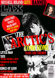
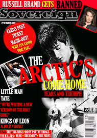
The cover itself was very similar to ‘NME’s’ as the two artists on the front are in the same stance and both use the direct gaze. Also the cover lines are both done in the same dominant red which is bright and is in contrast to the black background. Furthermore the fact that the cover line is ‘The Dibbs’ also serves as an anchor to the main cover image as it tells the reader who the image is of what they can expect in the magazine.
Furthermore the magazine does not span the top of the magazine like mastheads such as ‘Kerrang’ it conforms to the style of NME as it is placed in the top left hand of my magazine front cover.
I have used a promotional method on my front cover as I have put about Leeds Festival Tickets and how they effect the reader. By doing this I engaged the readers attention as they believe it does actually effect them.

My contents page follows many of the typical conventions which could be expected in a magazine. This is as it has the Masthead at the top, large and clear for the reader to see and recognise. Also it has Images with writing on, used as anchorage informing the reader about who is in the picture, and has page numbers next to the articles which they relate to. More specifically in reference to my magazine being designed like NME it has a Band Index which tells the reader where certain bands are with the magazine. This is a typical convention of the magazine NME so I decided to include my own.
My magazine is set out in a similar layout, in reference to pictures, as NME’s contents as I have one large image on the page, which is referring to the main article and double page spread. Also the contents are along the right hand side which is similar to NME.
Finally my double page spread features many generic conventions such as drop capitals at the start of new articles. Also the main picture in my double page spread takes up all of one page and this is a typical convention as they usually take up all of one page if not more.




No comments:
Post a Comment