
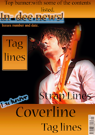
This contents page has many of the typical conventions which are expected in a music magazine. Firstly it has the Masthead clearly pointed at the top of the page. By doing this it is made clear to the audience which magazine this is. Also there are promotional methods used as a large box is used at the bottom which promotes the magazine as it mentions about subscription details. By doing this they can ensure that there readership stays high as readers who are already reading the magazine would be interested in subscribing to it. Black is used as it connotes strength and power so it gives the impression that the music and artists in the magazine will be powerful and strong. Also the colour of red used connotes danger so it may appeal to the male audience more as it reinforces their masculinity. The white however contrasts with the red and black and as a result make it apparent to the audience that the magazine is not heavy rock or metal. One large image is used in the centre of the page which means draws the audience’s attention to that and it connotes that that picture is from the main and most important article.





No comments:
Post a Comment